End to end.jpg

UX & UI

Web Design • UI & UX Design
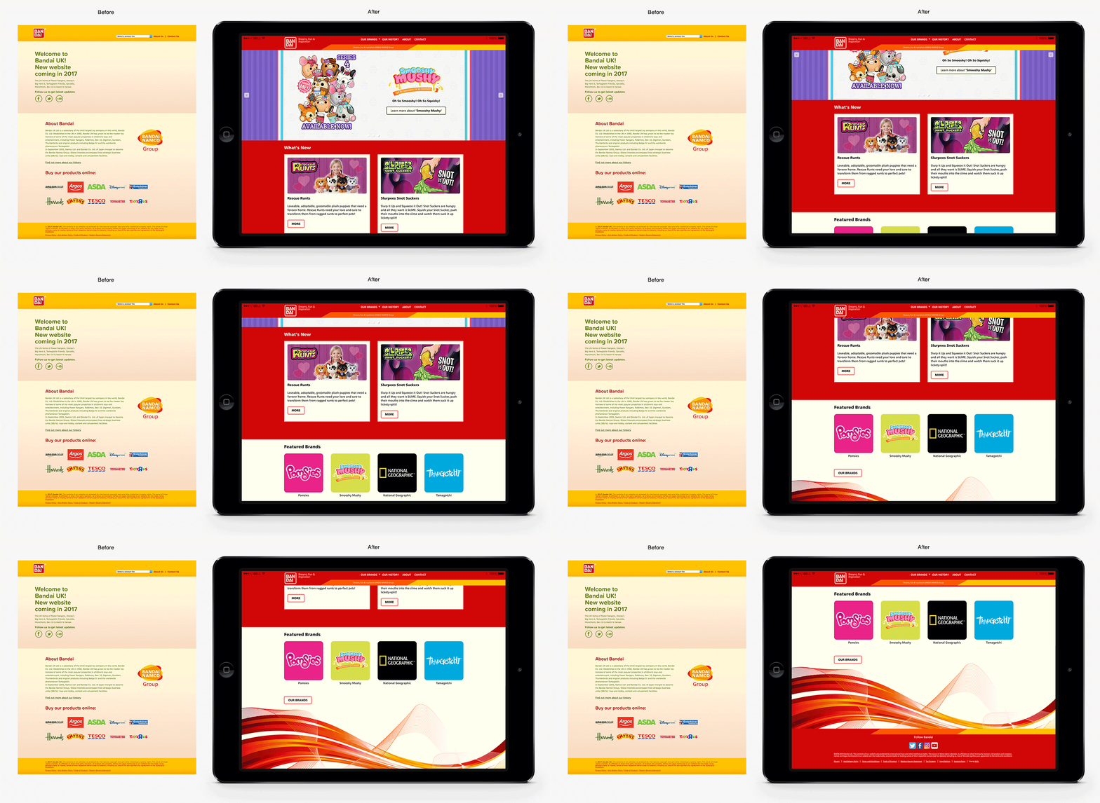
 I started by planning what elements needed to be included on the website by creating wireframes for the assets and components ensuring they worked across devices responsively.

I started by planning what elements needed to be included on the website by creating wireframes for the assets and components ensuring they worked across devices responsively.

 Curved corners were added to elements across the site to reflect the shape of the Bandai logo.

Curved corners were added to elements across the site to reflect the shape of the Bandai logo.

shape.jpg
 Easy access to Bandai's brands were achieved with a fixed navigation menu that remains visible in the same position as the user moves throughout the site.

Easy access to Bandai's brands were achieved with a fixed navigation menu that remains visible in the same position as the user moves throughout the site.

 The colour red is the brands primary colour for the toy sector, however yellow and orange were added to celebrate that the business is part of the wider Bandai Namco Group.

The colour red is the brands primary colour for the toy sector, however yellow and orange were added to celebrate that the business is part of the wider Bandai Namco Group.

Swoosh2.jpg